

The Brief
DESCRIPTION
A branding system for a pub dedicated to creation of table tennis in England in the 19th century. Forming a space for people to play ping pong and grab a drink or a light bite to eat while enjoying the game.
PROBLEM
It has been largely forgotten that table tennis began in England at the end of the Victorian era, as competitors currently lean towards an American style to appeal to audiences.
OBJECTIVE
To provide a space that celebrates the English heritage of table tennis by providing room to play and connect with others in a classic pub space.
POSITIONING
While there are numerous entertainment places that offer ping pong as a gaming option, they also offer other arcade options that draw away from the focus of table tennis. In order to focus on the traditional English background, our company will highlight the Victorian era as its timely origin.
AUDIENCE
Looking towards a younger audience of millennials and gen-z that are searching for something fun to do on a night out.
MEANS
Complete brand package including a style guide, collateral, exterior shots, signage, an app, and an ad campaign.
VOICE WORDS
Witty, passionate, informative

Taking the brief and beginning a crucial step
of the process: research
RESEARCH
I took a deep dive into the history of ping pong, and how it was originally born from traditional lawn tennis.


VISITING WIMBLEDON
I had the opportunity to work on this client while I was in London for four months, and was able to visit the iconic Wimbledon museum right as the research for this project began.

From naming to early sketches to beginning stages of concept, exploration is built off research


STYLE DEVELOPMENT
In the early stages of working on this client, I experimented with different directions to take the style, each one based on something I had found in my research. During this part of the process, I always like to push an idea in different ways to explore different possibilities. These explorations eventually led to a more solid and developed style guide, but they were a good way to begin to dive into the work.


SITEMAPPING
One of the pieces I decided to design for the pub was an app that could pair customers with other ping pong players, along with helping them find the nearest ping pong pub to them. I started with early sitemap planning and thinking of the capabilities the app would need, before jumping to design.

Continuing to get critique and starting to
hone in on something strong
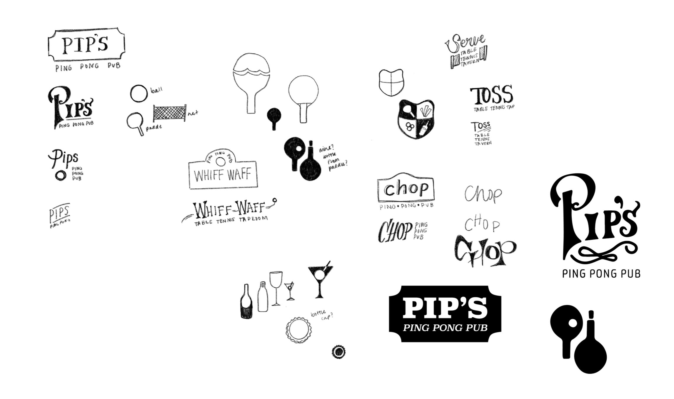
LOGO IDEATION
After coming up with many names, I landed on Pip’s Ping Pong Pub. The rubber grips on a paddle’s surface are called ‘pips’, and the name was a perfect fit for the energy of the company. Then it was all about exploring ideas for the brand mark and logo system. While researching and discovering ping pong’s ties to the royal family starting in the Victorian Era, I also discovered that the first stamp was an image of Queen Victoria herself. This in turn inspired some of my logo design, along with traditional pub signage.

DEVELOPING THE STYLE GUIDE
Starting to hone in on the voice of the brand, I put together a style guide that felt representative of the witty yet charming look of the pub. From here I incorporated Victorian era patterns I designed to include ping pong paddles, along with traditional royal imagery juxtaposed with bold typography.


BRAND APPLICATION
Deciding to go with the ‘stamp’ inspired logo, a nod to ping pong’s Victorian background in multiple ways, I worked with iterations using colors from the developed style guide. From a simpler logo relying on only type and testing out embellishments to add to the flair in Pip’s voice, I began working to apply the style to collateral.


Final photography I art directed, with collateral all designed and built by me


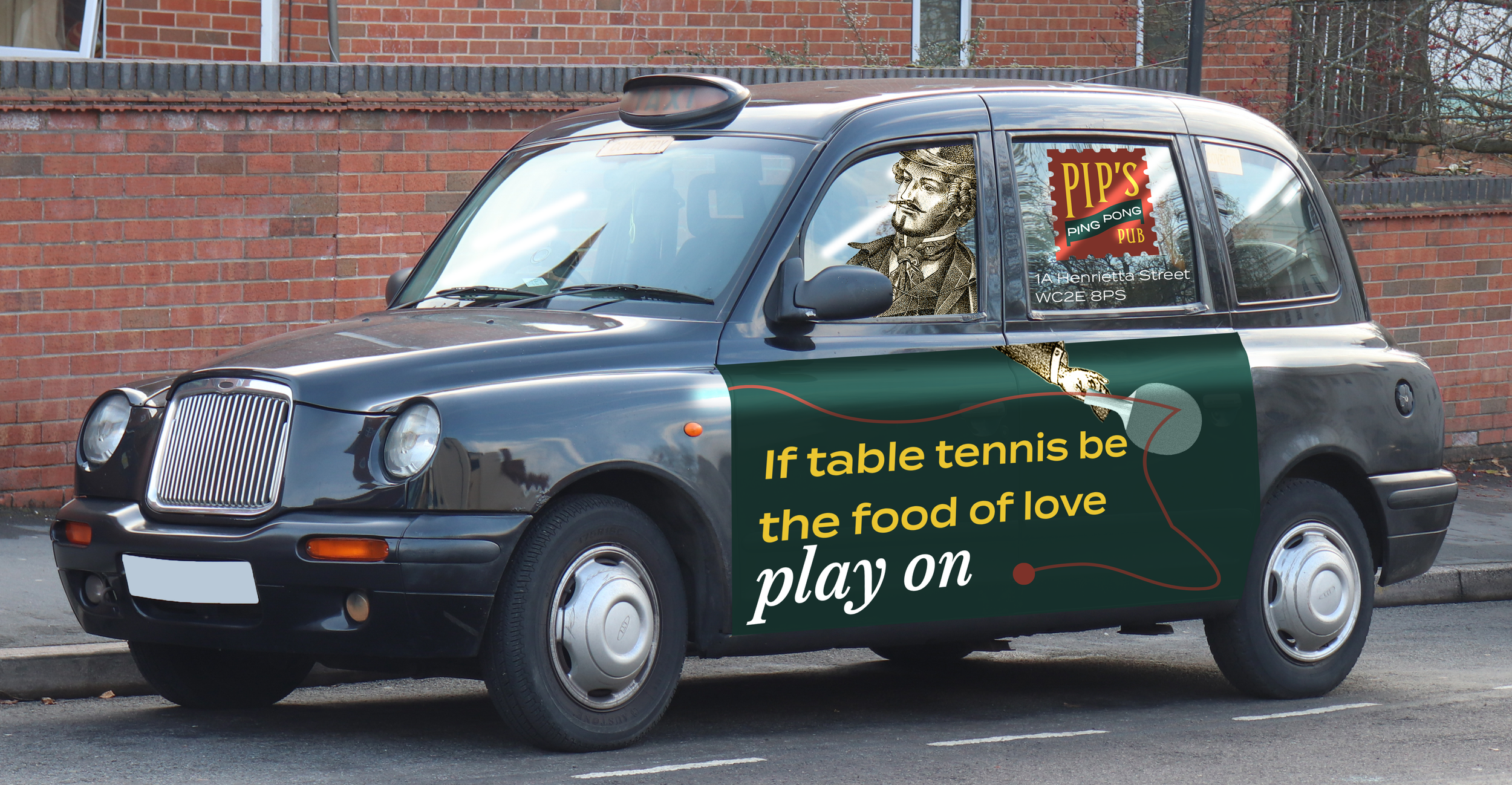
Highlighting Pip’s English heritage using well-known Shakespearean quotes intertwined with language derived from ping pong.
THE AD STRATEGY


Want to hear more? Send me an email or give
me a call, I’d love to walk you through my process.